Tuesday, 2 May 2017

Comparison of conventions


After studying and comparing my final magazine cover, I have tried to follow similar conventions used with this magazine. In addition to this, I also made sure that my magazine met my target audience.

As displayed, "Rock Sound" met the conventions of a rock magazine well. By using bright bold colours my audience is easily drawn in, also, with text not being straight, but at different heights and sizes, it is evident it makes the front cover look exciting and modern.

As you can see from the front cover I had produced, I have tried to also do this. The main image layers over my master head, but is still readable. Moreover, the cover lines included are in a similar location, as well as not giving too much of the narrative away.

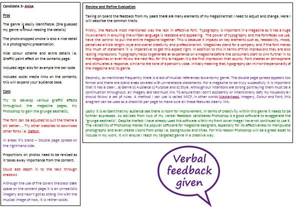
Having produced a focus group, I was able to ask a range of individuals what they thought of my music magazine, in compassion to current contextual magazines which is already out there to be viewed. That way I can find out thoughts and opinions of the content and use this information to further develop my own. Lastly, I have attached a voice recording which identifies these comments.

Monday, 27 February 2017

Raw images


These are the raw photos which I took for my final magazine cover. It links well with my target research and I feel shows the theme Rock well.

Wednesday, 22 February 2017

Format Research Evaluation


What I learnt from creating a format research is how to convey the aesthetic of ‘Rock’ successfully.
The house-style in ‘Rock’ magazines expresses a pattern of direct and ‘in-your-face’; fonts, colours and headlines. For example, in NME the vigorous colouring and large titles is a paramount feature in all Rock genre magazines, this is important because the impression of a ‘Rock’ music image is loud and expressive, as a result, the aesthetic would not be harmonious it will connote a big and bold statements. Specifically in the ‘NME’ contextual study it indicates ‘Rock’ in an audacious statement. The magazines colour scheme of ‘blue, red and white’ is a very ironic way of how ‘Rock’ is usually exhibited. Correspondingly, ‘NME’ magazine portrays how there are many aspects of ‘Rock’ that may appear controversial to the stereotypical one, however does not defy the objective of Rock, they still have a strong presentation of the genre. Unlike the contentious analytical view of Rock, the magazines where I had gained more precise knowledge according to the conventions of a rock magazine, is the more classic versions. For example, ‘Classic Rock’ and ‘Rock Sound’. Both these magazine make obvious links within their editions, firstly they typically put their main image on the centre of their front covers.


This bull’s eye-composition produces a focal point, which means the element in the shot that the viewer’s eye is naturally drawn to, and also adds a sense of scale to your pictures. In addition to this, the clarity of the photo suggestively indicates that the magazine is centralized on that enhanced figurative focus. Furthermore, ‘Classic Rock’ also included the band’s name “GUNS N’ ROSES’. This furthers aids the audience in what the focus of the magazine is.  As well as this, rock is signified through its association with colour and it is evident that these foundations are black, white and grey. In contrast a pop of colour is still an effective element as it displays the energetic expression that Rock has. However I must ensure the colours are not random and relate well so the theme is recognizable.


Overall, the media conventions used are very specific to their target audience. I will ensure to use these as much as possible to allow my audience to recognize this magazine visually as a ‘Rock’ magazine. If I am to follow the knowledge from these techniques it will allow me to produce a well-executed final piece. 

Final version