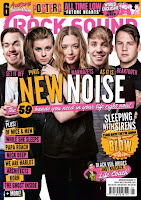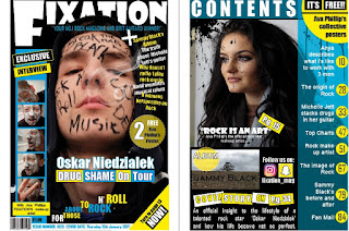
After studying and comparing my final magazine cover, I have tried to follow similar conventions used with this magazine. In addition to this, I also made sure that my magazine met my target audience.
As displayed, "Rock Sound" met the conventions of a rock magazine well. By using bright bold colours my audience is easily drawn in, also, with text not being straight, but at different heights and sizes, it is evident it makes the front cover look exciting and modern.
 As you can see from the front cover I had produced, I have tried to also do this. The main image layers over my master head, but is still readable. Moreover, the cover lines included are in a similar location, as well as not giving too much of the narrative away.
Having produced a focus group, I was able to ask a range of individuals what they thought of my music magazine, in compassion to current contextual magazines which is already out there to be viewed. That way I can find out thoughts and opinions of the content and use this information to further develop my own. Lastly, I have attached a voice recording which identifies these comments.


No comments:
Post a Comment